GT Sectra Font
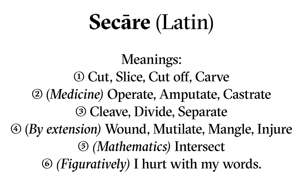
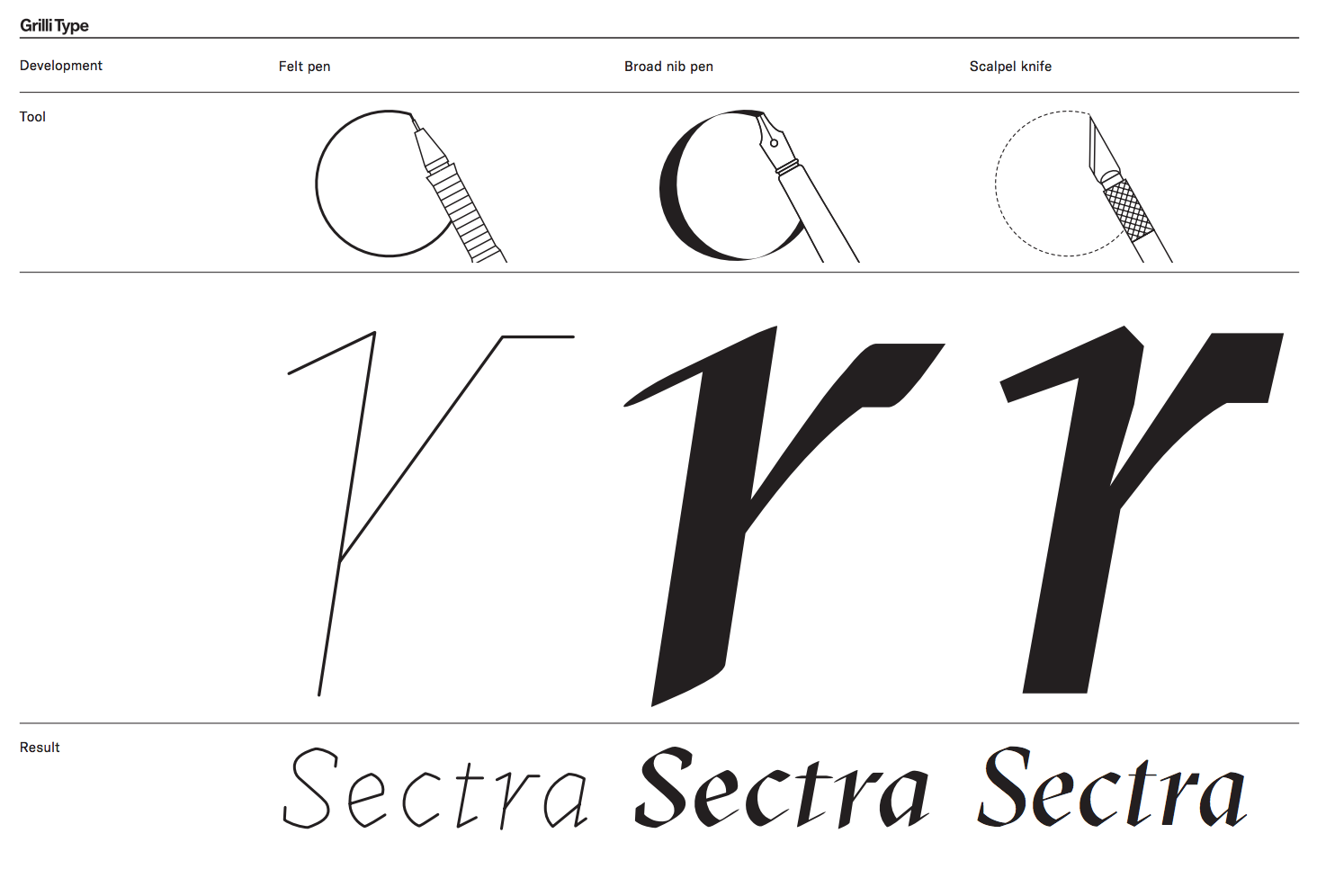
GT Sectra is a serif typeface combining the calligraphic influence of the broad nib pen with the sharpness of the scalpel knife.
Zürich based design studios Moiré and Grilli Type took years to develop and design GT Display Sectra, 5th26's logo typeface.
In an increasingly digital and searchable world, we spoke with Grilli Type’s co-founder Theirry Blancpain on his design process, what inspires him and how the best way to create something new is to look at something old.
GT Sectra
Grilli Type's founders Theirry Blancpain & Noël Leu
How did you get involved in typeface design?
I started designing simple geometric typefaces in the years before I attended design school, and then at school I met like-minded friends. There was no formal type-design training available, so we started what we jokingly called a self-help group. Every Friday we sat together and showed each other what we’ve been working on.
GT Sectra is a modern font with geometric lines, yet it was inspired by calligraphy which is more historic. Where do you get your inspiration from and does it often involve opposite forces?
At Grilli Type, we release the type design from a group of friends. GT Sectra was designed by Marc Kappeler and Dominik Huber from Zurich-based design studio Moiré, as well as Grilli Type co-founder Noël Leu. I note this because every person works differently, and we all complement each other in our work and our views.
For GT Sectra itself, it was a case of working on the design again and again over the span of about three years. During those years it was already in use in the long-form journalism magazine Reportagen, also designed by Moiré, and its profile and concept came into focus over that time. Seeing it in use, in print, allows you to see which things work and which don’t, and so it slowly took shape and became more and more what we released to the public. But generally speaking, we are always interested in marrying concept and form into an overall interesting package. Form alone is often boring, and concept alone isn’t design yet. Developing a concept and finding the right form for it is the interesting part.
Everyday we are exposed to visual language, from the products we use to the world around us. Do they influence your work?
Surely we are all influenced by the things around us. Generally I am more interested in older things, as looking at too much contemporary work by others just leads to an eternal feedback loop that seems quite superficial to me.
How long does it take to create a new typeface and what does the process involve?
Typefaces take a long, long time to bring to the level we want to have them at. GT Sectra took about three years of on-and-off work by three people. Another upcoming release, planned for 2016, started its first incarnation in 2008. Other designs are a bit faster, but it always takes thousands of hours of work to create the now nearly thousand characters that are required to support a wide array of languages, and to bring the design to a level that satisfies us.
Your fonts and typefaces have been used in various printed publications including OFFWAYS Magazine, Reportage and GQ. With and increase in digital apps that allow content to be viewed with a swipe or click, do you think there will be a need for more unique typefaces in the future or is the demand generated by print content first?
Of course reproduction of type plays a role in how it functions, but we are not primarily concerned with that in the design of our typefaces. The typefaces are tools, and their usage is either well done or not. Luckily we have a large number of great customers who create amazing work with our typefaces – in print and on screen.
What can a brand’s chosen logo or typeface tells us about it?
Design influences and steers our perception of content. In the case of a brand, many things come together, and need to be congruent: the design needs to fit the actual voice of the brand, the people behind it, the company and how it communicates with its customers. All of those things need to fit for a great brand, not just the typeface. But of course it’s a start.
You live and work in Zurich. Can you tell us what you like the most and least about it?
Zurich is an incredibly green city, with about 40% of the city’s area being parks and forests. I never appreciated that until I traveled more. For its size it’s a very culturally rich city, with lots of concerts and exhibitions going on, but it’s still a small city compared to cities like Tokyo, London, or New York.
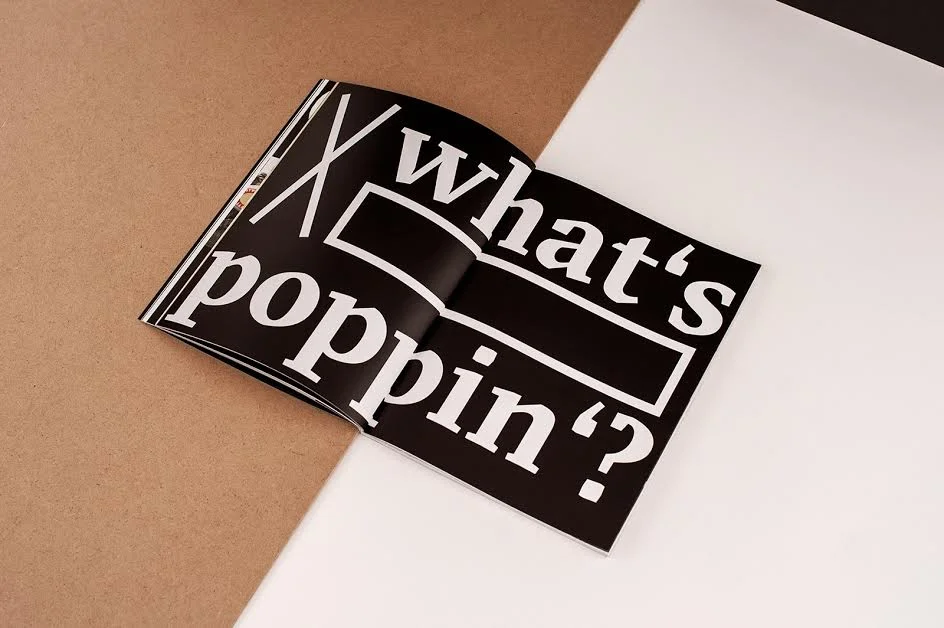
GT Sectra used in OFFWAYS Magazine. Photo by Nils Laengner
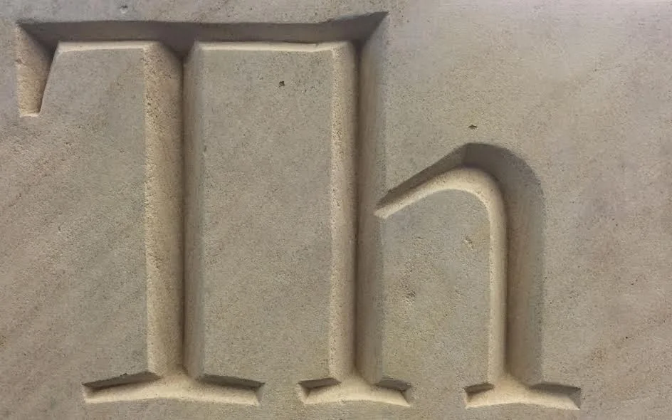
Stone Carving by Matthew Johnson
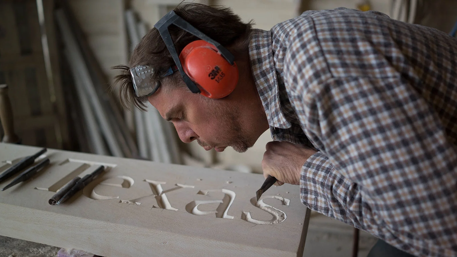
Photos: GrilliType